Impression Ventures Case Study
Impression Ventures invests in startups revolutionizing financial technology, from banking, insurance, and wealth management.
This brand represents the foundation of cutting edge innovation in a rapidly growing sector. For this identity, the intention was to create a brand that feels innovative and egolessly bold, prioritizing their strong results to investors and preeminence for founders.
I edited Impression’s classic mark - a spark, an homage to their name, but now with sharper, stronger edges to exhibit authority.
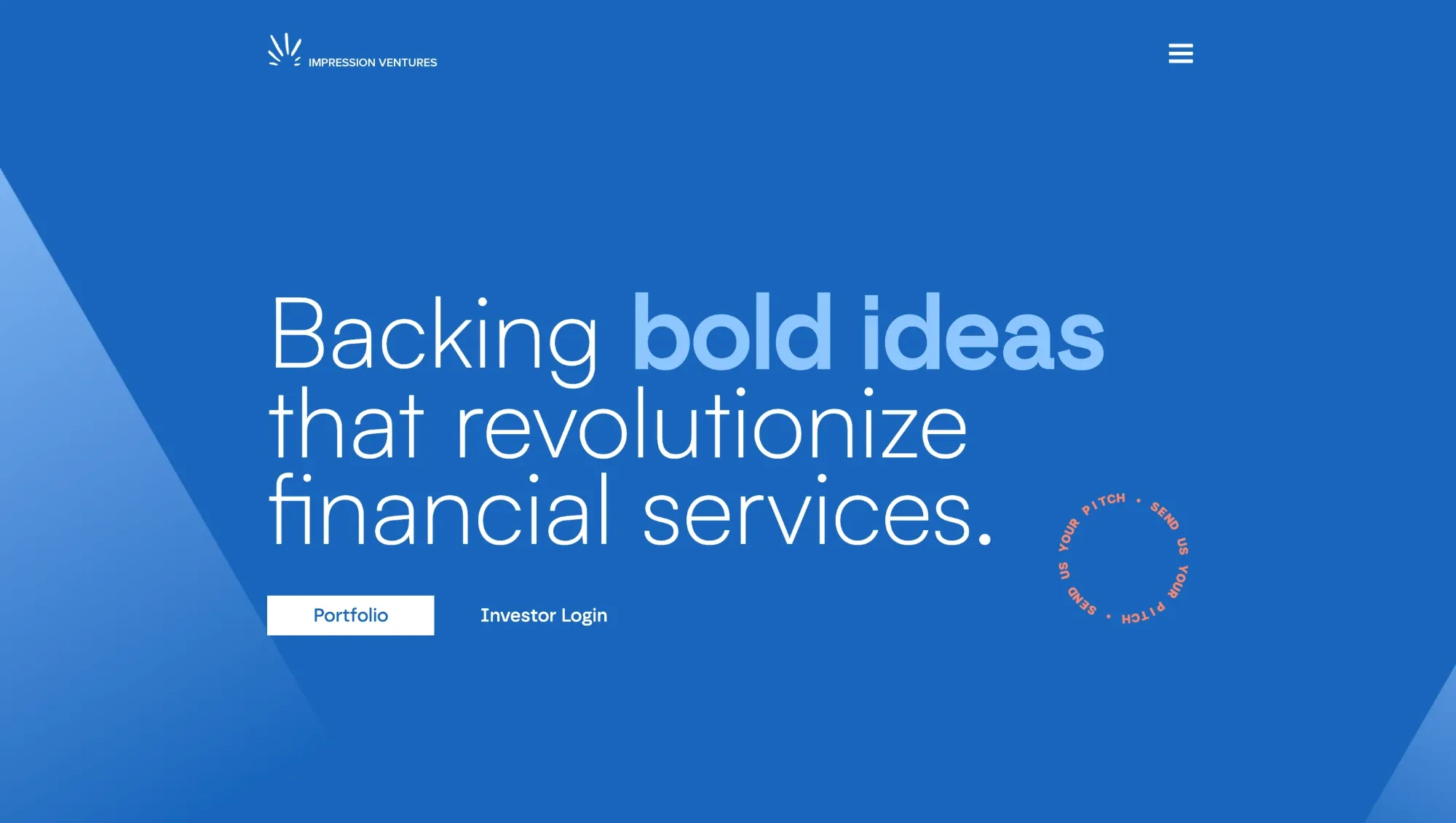
View the rebuilt siteGlass hero for authority, with a preview of different site pages. Professional & an assertive first impression.

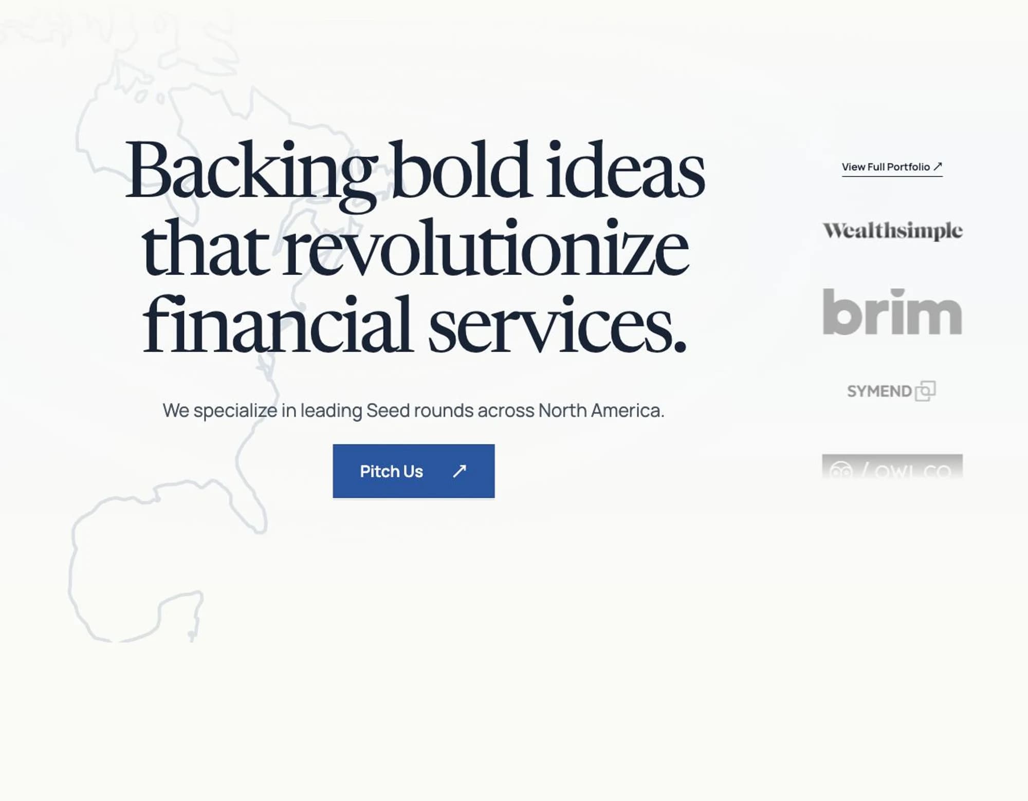
Immediate CTA for CEOs in a rush. A one liner that describes the kind of companies Impression invests in - no need for searching through the endless text below. North America graphic with the translucent outline fills in negative space in a way that maintains minimalism.
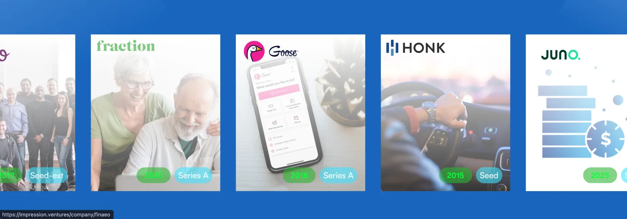
Vertical carousel showcases brands that do not disrupt the site’s colour palette.
- 01/02 is unnecessarily text heavy and subtext drifts the viewer away from the paragraphs (critical text).
- Boxes 03/04 do not answer the "where we invest" question.
- Removed the subheading & subtext, 03/04 boxes, and summarized the “fintech specialists” and “seed stage experts” sections to the most critical, important information.
- If CEOs want a more in depth description of Impression’s investments, they will find the dedicated page.
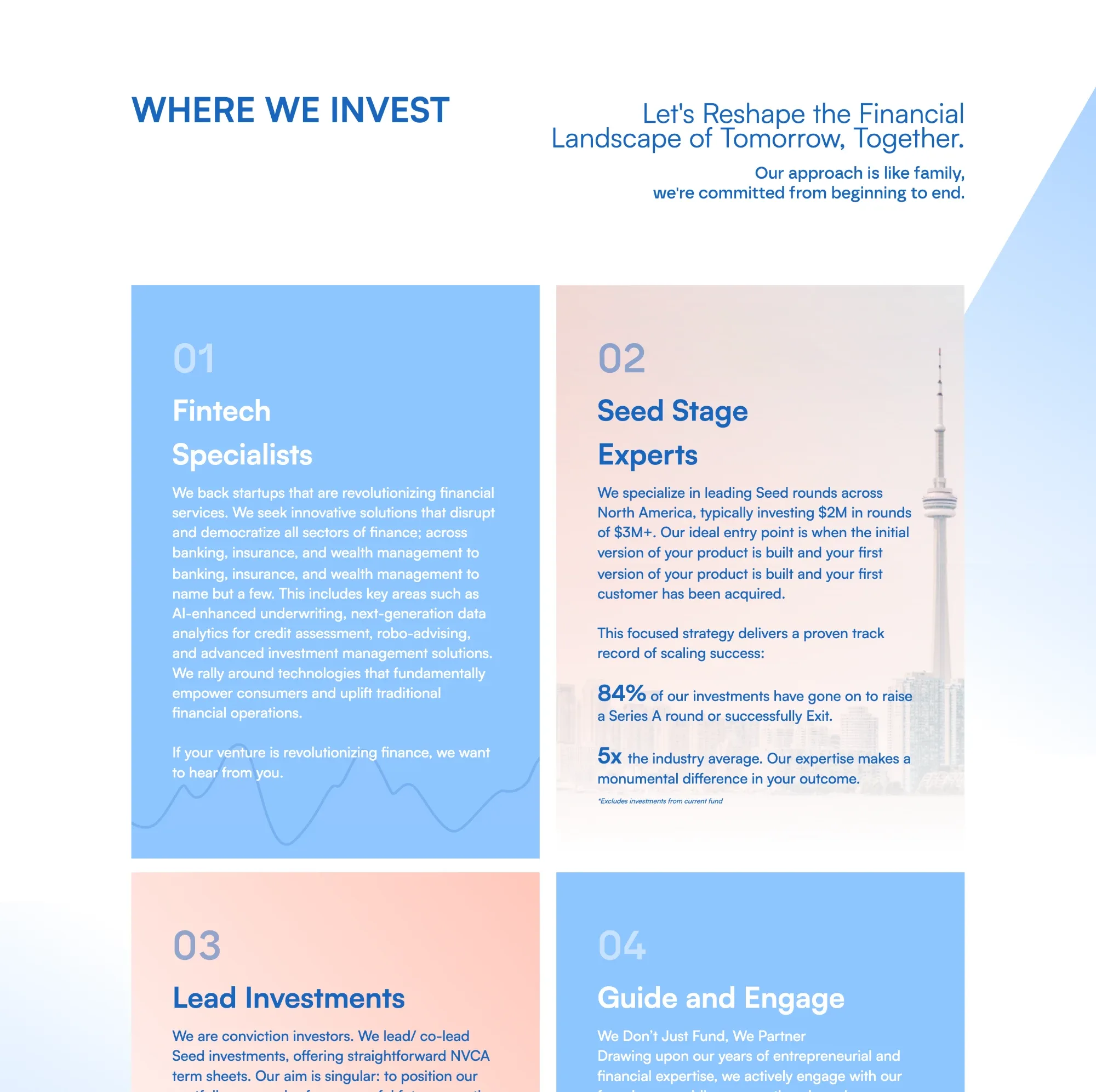
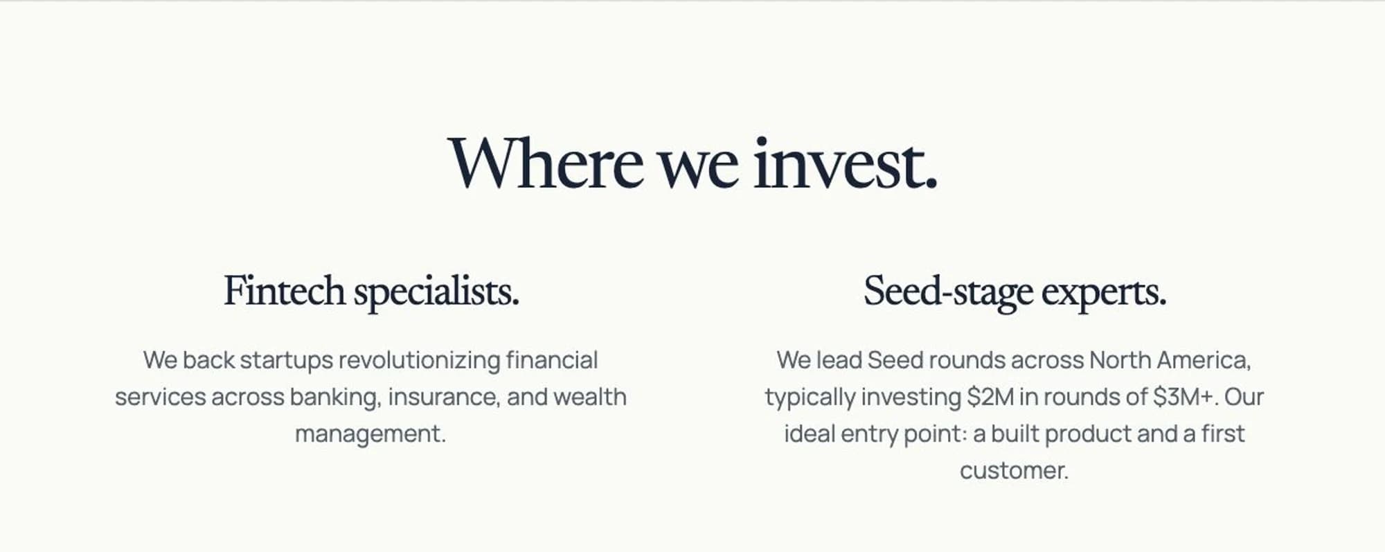
Summarized/added on-theme graphics I made with Astra that provide the same value as the long paragraphs
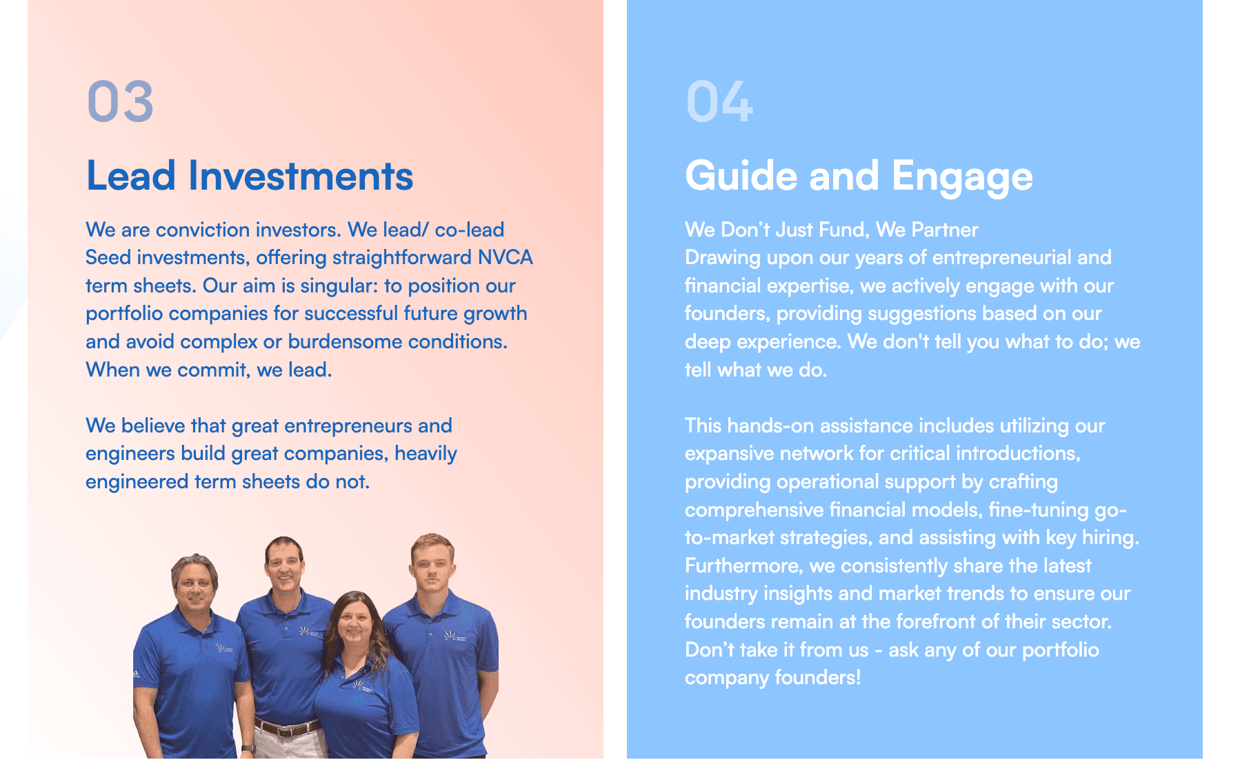
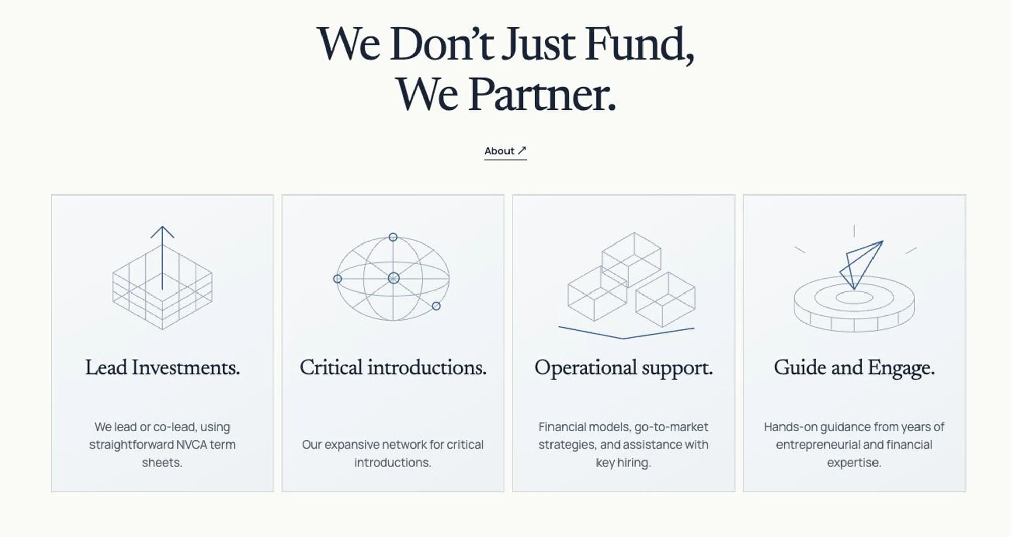
Removed the text-heavy heading and replaced it with a minimal testimonial. Don’t explain what the section is when it’s obvious.
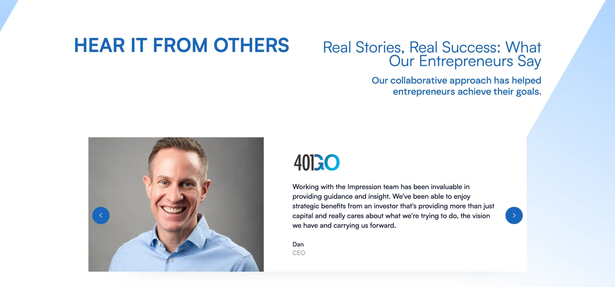
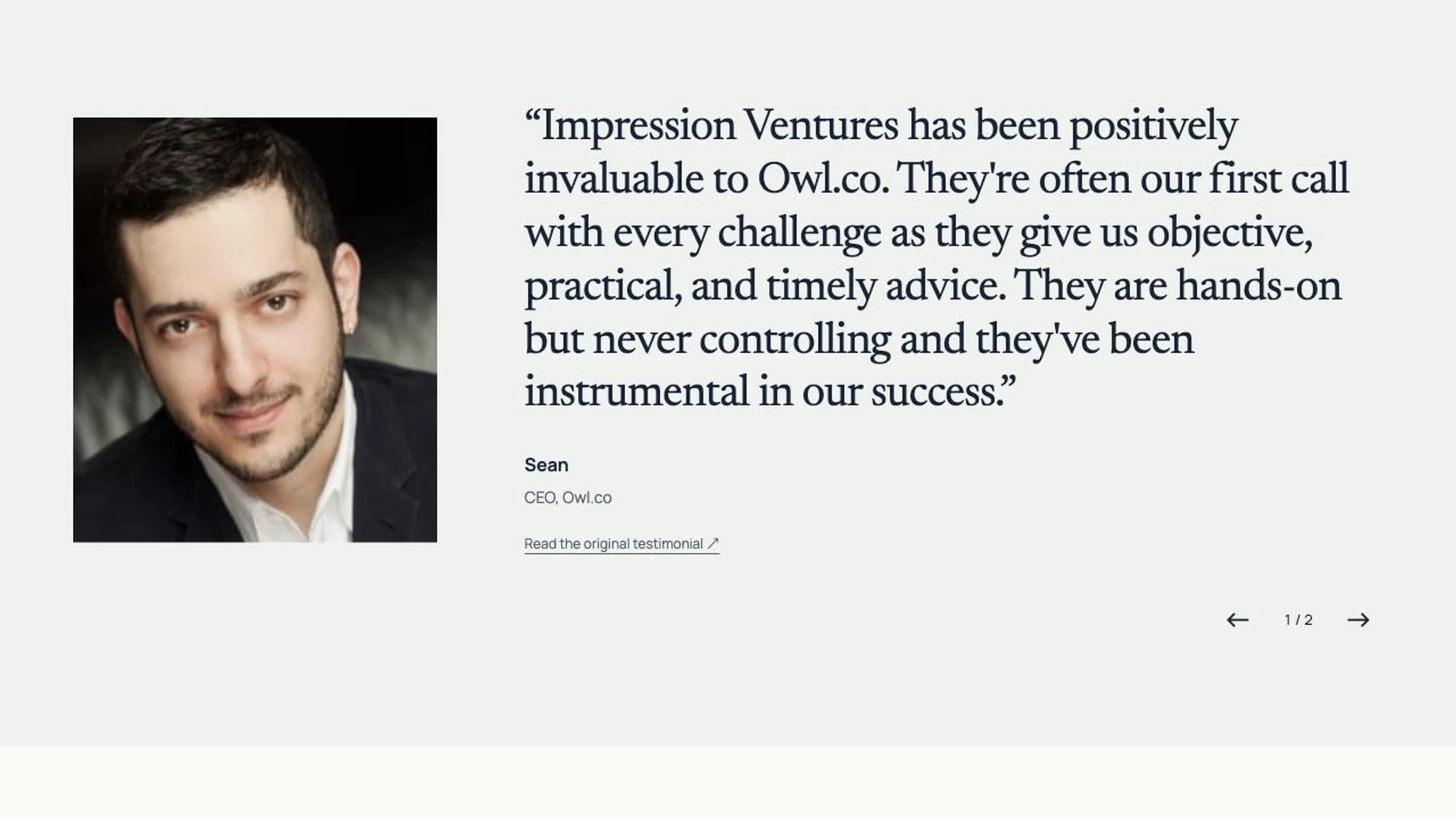
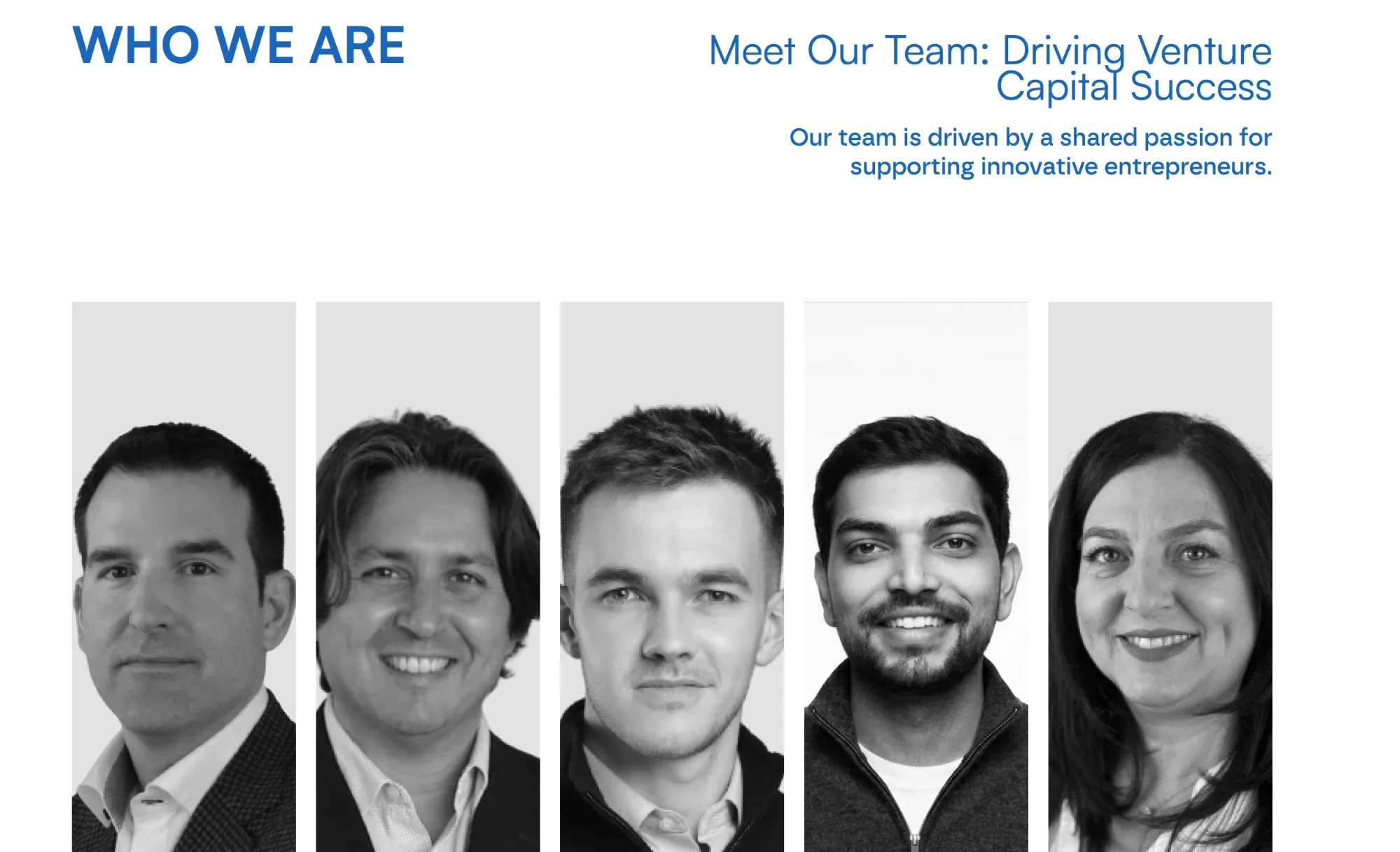
I replaced the team headshots. Hovering to reveal text adds no value, and headshots take up unnecessary space. Show how great the team is on dedicated “Our Team” and “Our Advisors” pages.

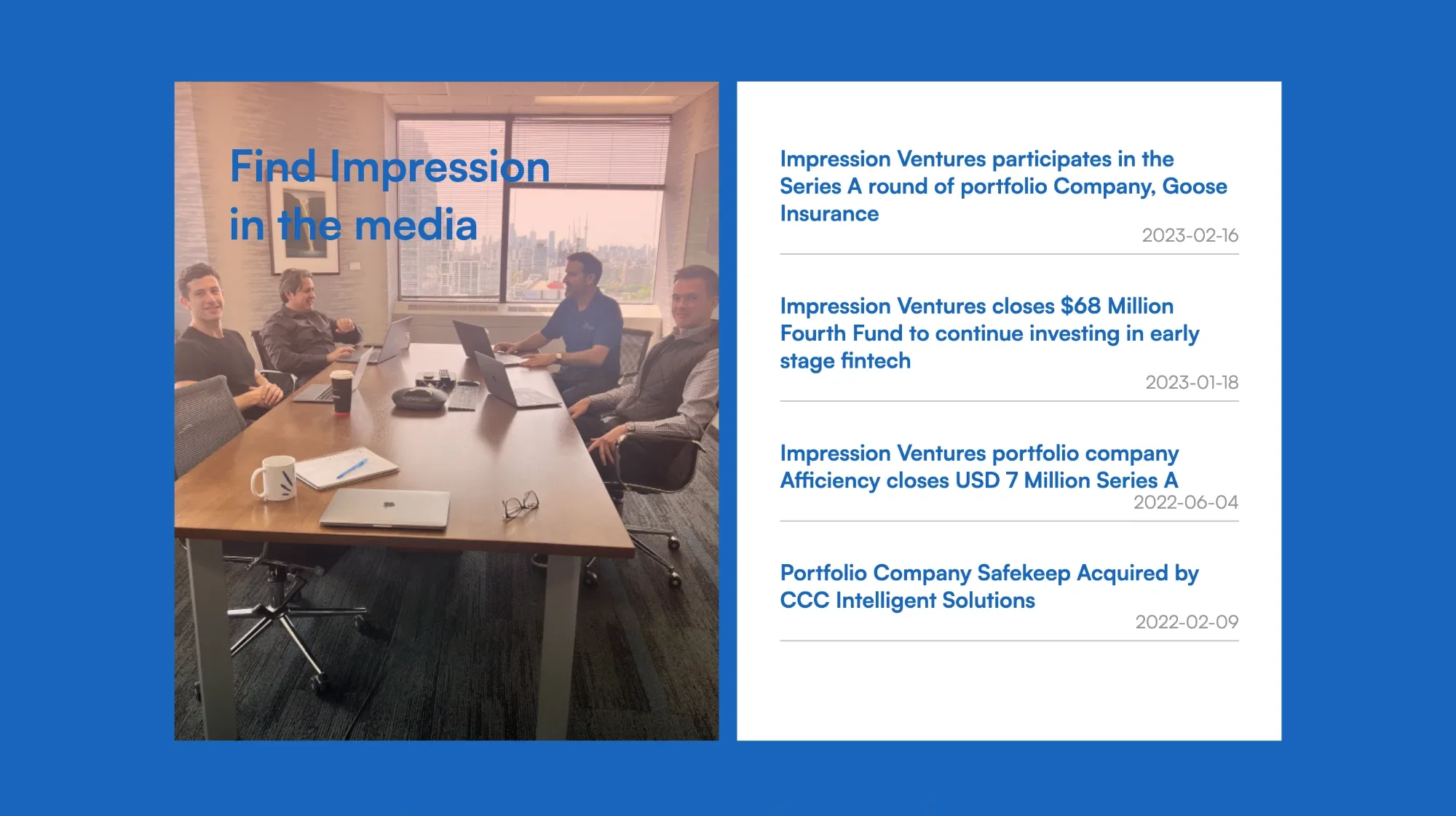
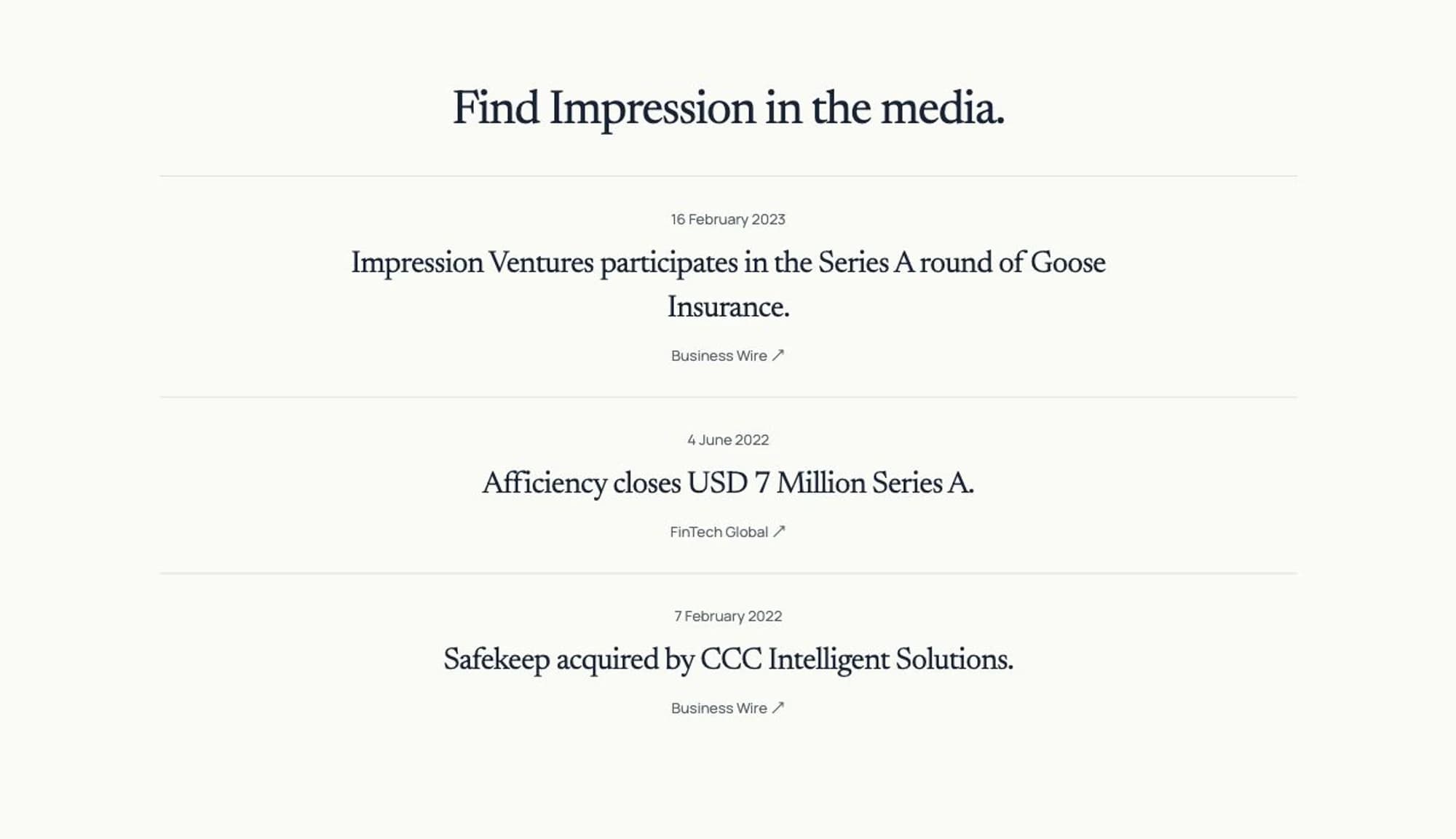
Media section is outdated & the text/image overlap is unpleasant to look at. Simplified the section on theme.
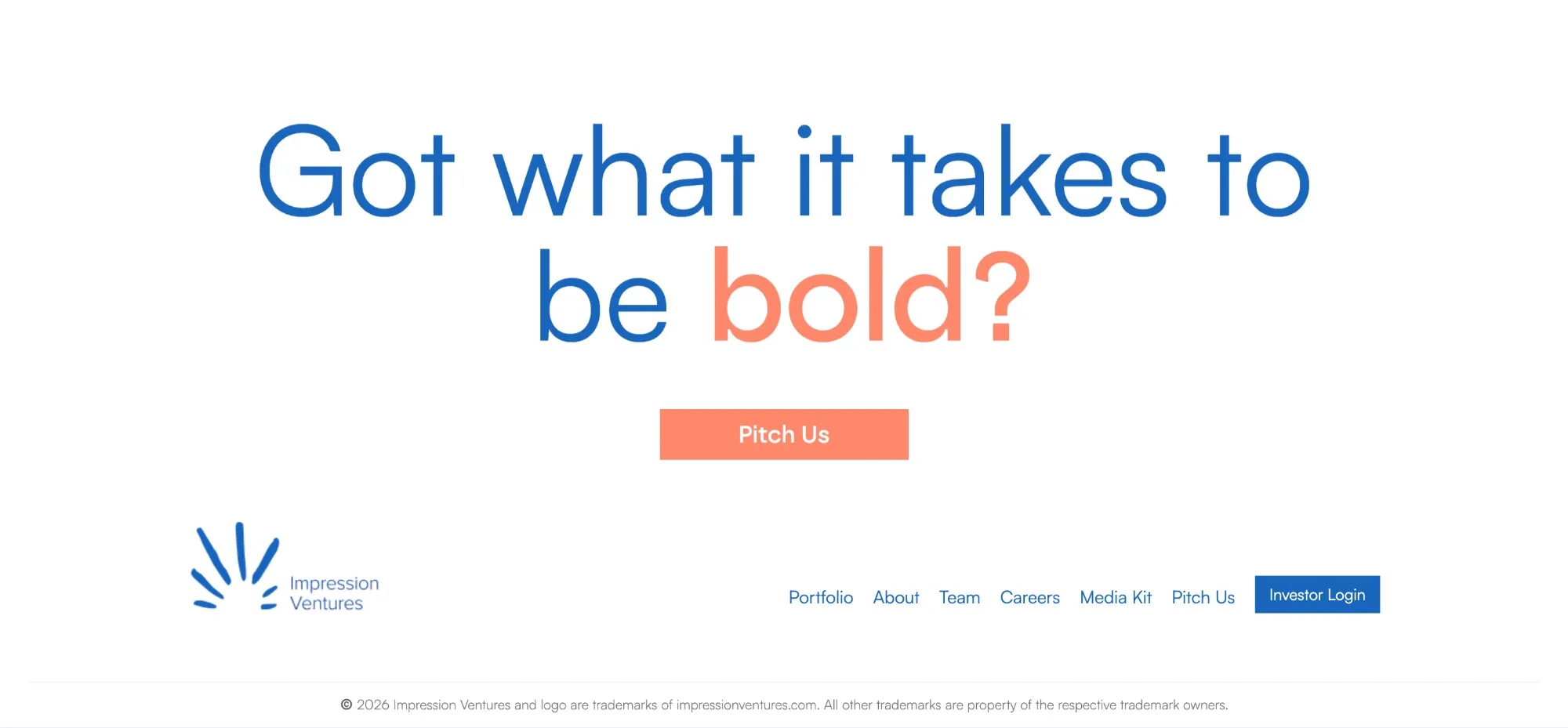
The footer is unnecessarily loud. Final CTA should be simple & easy to look at.